Homeownership rates in 1994:
White Americans: 67.7%
Hispanic Americans: 41.2%
Black Americans: 42.3%
Native Americans: 51.7%
Asian Americans: 51.3%
An honors thesis, adapted for the web · The University of Arizona · May 2025
Augmenting the humanities through immersive data visualization
“And herein lies the tragedy of the age: not that men are poor, — all men know something of poverty; not that men are wicked, — who is good? not that men are ignorant, — what is Truth? Nay, but that men know so little of men.”W.E.B. Du Bois · The Souls of Black Folk · 1903
William Edward Burghardt Du Bois is widely regarded as one of the most influential African American scholars in history. A renowned sociologist, author, historian, and civil rights activist, Du Bois studied ways to confront the systemic racism and injustice that plagued Black Americans between the end of Reconstruction and the Civil Rights movement. In doing so, he coined an inventive approach to visual design — one that indelibly transformed the field of modern data visualization.
At the 1900 Exposition Universelle in Paris, Du Bois unveiled his Exhibit of American Negroes: a set of 63 hand-drawn charts visualizing the socioeconomic conditions of African Americans in the late 19th century.11W.E.B. Burghardt Du Bois, “The American Negro at Paris,” The American Monthly Review of Reviews XXII, no. 5 (November 1900): 575–77. These colorful, precise charts painted a complex picture of Black America that countered European narratives of racism and colonialism present at the exposition. They were more than statistical graphics; they were data portraits, drawn to lay bare rampant inequality while lauding the progress and ambition of Black Americans — a methodology that rendered data accessible to all.
This project takes Du Bois' work at the Paris Exposition as both an object of study and a methodological provocation, asking how his visual logic might be extended through the contemporary tools of digital and immersive media. It unfolds as a trimodal re-engagement: re‑creation, reproducing one of his charts in code; re‑imagination, teaching his aesthetic to a generative AI; and re‑interpretation, applying his method to my own city. These culminate in Hello, Black World — three immersive, web-based data stories built in his design language.
In this thesis, I argue that immersive data visualization — rooted in rhetorical clarity and designed for spatial interaction — can deepen public engagement with complex social data, offering scholars a powerful tool for storytelling, pedagogy, and justice-oriented research. Through a multimodal and iterative engagement with Du Bois' work, culminating in the immersive experience of Hello, Black World, I contend that information science is at an inflection point. Just as Du Bois leveraged the technologies of his time to visualize injustice, so too must humanists and data designers harness the immersive and interactive affordances of contemporary tools. Immersive data visualization is not merely a technical advance; it is a methodological imperative — one that invites scholars to reimagine public scholarship, pedagogy, and the visual rhetoric of justice. This webtext is that argument put into practice: the thesis, adapted into the very medium it advocates for.
Paris, 1900
Du Bois unveiled his exhibit just four years after Plessy v. Ferguson, on a world stage shaped by the racial violence of Europe's colonial ambitions. He and his Atlanta University students carried sixty-three hand-drawn plates across the Atlantic.
The charts leveraged bold color, geometric clarity, and rhetorical precision. Bar charts wound into spirals, maps became colorful mosaics, and entire datasets fit on a single board.
Together, they painted a complex picture of Black America that countered the prevailing narratives around them — data portraits, drawn to highlight rampant inequality while lauding the progress and ambition of Black Americans.
This is the visual grammar my thesis studies, and extends.
Plate I
Du Bois' charts lie squarely at the intersection of scientific data visualization and intricate art, and it is this deliberate intersection that fuels their power. Yuke Zheng observes that they “operate as disciplinary misfits in a liminal space between data and art.”22Yuke Zheng, “The Liminal Space Between Art and Data: Du Bois's Data Graphics as Disciplinary Misfits” (2021). Within this space, Du Bois embeds the complex cultural meanings of his data within vibrant colors, abstract shapes, and visually arresting patterns. Zheng notes that Du Bois' style departs from traditionally purist takes on data visualization: he counters Edward Tufte's dismissal of decorative elements as “chartjunk,” instead asserting that Du Bois' inclusion of detailed aesthetics underscores the charts' communicative power and cultural resonance. Du Bois leverages bold, contrasting color pairs such as vivid reds and greens to highlight stark racial and socioeconomic disparities, using visual contrast to emphasize the complex reality of the color line.
Scholars have also framed this stark visual rhetoric as an act of decolonial resistance. Lynda Olman characterizes the Paris Exposition charts as “the first attempt to decolonize the infographic,”33Lynda C. Olman, “Decolonizing the Color-Line,” Journal of Business and Technical Communication 36, no. 2 (2022): 127–64. citing Du Bois' use of non-Western motifs: patchwork quilting, zig-zagged lines, African American vernacular design woven throughout. These details serve a dual purpose. To the colonial eye they read as ornament; to the surveilled, they function subversively as information-dense technical documents — an homage to the coded quilts that once guided enslaved African Americans to freedom.
On the international stage, the exhibit fueled a counternarrative. Elisabetta Bini situates it within a worldwide context of racial violence — Plessy at home, colonial conquest abroad — that scholars have termed the “global color line.”44Elisabetta Bini, Drawing a Global Color Line: “The American Negro Exhibit” at the 1900 Paris Exposition (2014). Du Bois' deliberate comparison of African American figures side by side with European nations engaged visitors personally, detaching their attention from the degrading representations that surrounded his booth.
Du Bois proved that visualization can be a powerful medium of storytelling in the service of marginalized communities, and a lineage of scholars has extended the point. Lauren Klein visualizes Thomas Jefferson's correspondence about the enslaved chef James Hemings as concentric arcs, creating an “image of absence” that gives visibility to a man only faintly present in the archive.55Lauren F. Klein, “The Image of Absence,” American Literature 85, no. 4 (2013): 661–88. Nancy Peluso documents “counter-mapping”: indigenous activists in Bornean Indonesia drawing sketch maps to graphically contest the land claims of the state.66Nancy Lee Peluso, “Whose Woods Are These?,” Antipode 27, no. 4 (1995): 383–406. Hepworth and Church, examining the Lynching in America project, argue that visualizations are “inherently rhetorical” artifacts whose design choices determine whose knowledge is centered and whose is erased.77Katherine Hepworth and Christopher Church, “Racism in the Machine,” Digital Humanities Quarterly 12, no. 4 (2018). And Fileborn and Trott show feminist activists blending crowd-sourced maps with personal testimony, expanding what counts as data visualization at all.88Bianca Fileborn and Verity Trott, “‘It Ain't a Compliment’,” Convergence 28, no. 1 (2022): 127–49.
The common thread: visualization is not merely representational but epistemological. It shapes what we know, spotlights critical absences, and can empower communities to author their own stories.
Plate II
Empirical research on data visualization techniques has demonstrated that certain static visual design elements, including color, shape, and spatial layout, directly impact how viewers interact with data on a cognitive and psychological level.
Zacks and Tversky found that viewers cognitively frame bar charts and line charts differently even when the underlying data is identical: bars invite “discrete comparisons,” lines prompt “trend assessments.”99Jeff Zacks and Barbara Tversky, “Bars and Lines: A Study of Graphic Communication,” Memory & Cognition 27, no. 6 (1999): 1073–79. Try it yourself:
The same four numbers, twice
You're comparing: A is taller than B. That's the bar effect — discrete comparison.
The chart type primed you before you read a single number. Color does the same emotional work. Bartram, Patra, and Stone demonstrated that palettes carry affective weight — the same data can feel calm, alarming, or exuberant depending on hue alone.1010Lyn Bartram, Abhisekh Patra, and Maureen Stone, “Affective Color in Visualization,” CHI '17 (2017): 1364–74.
One chart, three moods
Muted blues: the data reads as neutral, administrative, safe.
Similarly, Blair, Wang, and Perin found that alongside color, the choice of “chart type, data trend, data variance, and data density” within a data visualization all play a role in determining the viewer's affective response.10b10bCarter Blair, Xiyao Wang, and Charles Perin, “Quantifying Emotional Responses to Immutable Data Characteristics and Designer Choices in Data Visualizations” (arXiv, 2024). Even properties the designer cannot choose — the shape of the data itself — carry emotional weight:
The data itself has a mood
A steady rise: viewers report higher valence and arousal — the most pleasant register, even though the numbers mean nothing.
Design also decides what you remember. Bateman et al. challenged Tufte's minimalism experimentally: viewers preferred embellished charts over plain ones, and showed significantly better long-term recall for them.1111Scott Bateman et al., “Useful Junk?,” CHI '10 (2010): 2573–82. Borkin et al. corroborated it at scale: color and “a human recognizable object” increase memorability, and unique chart forms outlast common ones.1212Michelle A. Borkin et al., “What Makes a Visualization Memorable?,” IEEE TVCG 19, no. 12 (2013): 2306–15.
A newer body of research extends these effects into immersive space — the case at the heart of this thesis. Gong et al. found museum visitors using augmented reality showed higher engagement and knowledge retention than those at static displays.1313Zhe Gong, Ruizhi Wang, and Guobin Xia, “Augmented Reality (AR) as a Tool for Engaging Museum Experience,” Digital 2, no. 1 (2022): 33–45. Liao et al. found VR climate communication “triggered more fearful responses” than flat video — interactivity communicates abstraction more viscerally.1414Mengqi Liao, Pejman Sajjadi, and S. Shyam Sundar, Science Communication 46, no. 3 (2024): 276–304. Martingano et al.'s meta-analysis shows VR reliably increases emotional empathy;1515Alison Jane Martingano, Fernanda Hererra, and Sara Konrath, “Virtual Reality Improves Emotional but Not Cognitive Empathy,” Technology, Mind, and Behavior 2, no. 1 (2021). Trevena et al. and Hadjipanayi et al. find first-person VR narratives elicit the strongest empathetic responses; and Gall et al. show that embodiment — identification with a virtual body — intensifies emotional response to virtual stimuli.1616Dominik Gall et al., Frontiers in Psychology 12 (2021); Lee Trevena et al., Virtual Reality 28 (2024); Christos Hadjipanayi et al., Personal and Ubiquitous Computing 28 (2024).
Taken together: aesthetically complex, culturally situated, immersive visualization isn't ornament on top of scholarship. It is a cognitively and emotionally distinct way of knowing — one that ensures data is not only visible but felt. The literature makes the case, as Du Bois did over a century ago, for a new mode of public scholarship. The next three chapters put it into practice.
Plate III · First Mode
To understand a visual grammar, redraw it. I chose Du Bois' 1899 chart “Land owned by Negroes in Georgia, U.S.A. 1870–1900” — a choropleth of the state, each county flooded with vivid color, each labeled by hand with the acreage of Black-owned land. There is no significance to any single hue; together they make Georgia a mosaic, hand-drawn testimony to Black land ownership one generation out of slavery.1717W.E.B. Du Bois, [The Georgia Negro] Land Owned by Negroes in Georgia, U.S.A. 1870–1900, 1900. Library of Congress.
Anthony Starks' #DuBois Challenge repository supplied the raw materials — county shapefiles and a spreadsheet of acreage and colors.1818Anthony Starks, “The #DuBois Challenge,” Nightingale, February 1, 2022. I rebuilt the chart in D3.js, which draws charts element by element — a process uncannily analogous to drawing by hand. Scroll, and watch it happen.
Step 1 · Geometry
I began by converting the 1899 county shapefiles to GeoJSON using QGIS. From there, D3's geoPath generator drew each of Georgia's counties onto the web canvas — a barebones map of the state in under 30 lines of code.
Step 2 · A first attempt at color
Then I sought to paint the map with Du Bois' data. Starks had labeled each county's color qualitatively — “green,” “brown,” “pink” — and the standard CSS interpretation of those names did not align with Du Bois' style at all.
Step 3 · The eyedropper
To solve this, I returned to the original chart with an eyedropper tool and replaced each color name with a hex code retrieved from Du Bois' own pigments. I also wrote a function that deterministically adjusts the opacity of each county's fill, mimicking the varying intensity of hand-applied watercolor.
Step 4 · The figures
Next, I added each county's Black-owned acreage at its centroid, set in Ugly Dave, a font that closely resembles Du Bois' handwritten datapoints.
For some reason, the datapoint for Appling County never appeared — so I added it manually, visually determining the coordinates of the county's centroid. It became the one hand-placed datapoint on a machine-drawn map.
Step 5 · The declaration
Lastly, I titled the chart in VTC Du Bois, a typeface created by a type foundry specifically in homage to Du Bois' signature block lettering, and I set the background to a beige that resembles the paper on which he drew.
The re-creation was complete — but how close did it come?
Below, Du Bois' original chart sits beside my re-creation. Drag the seam to compare them.
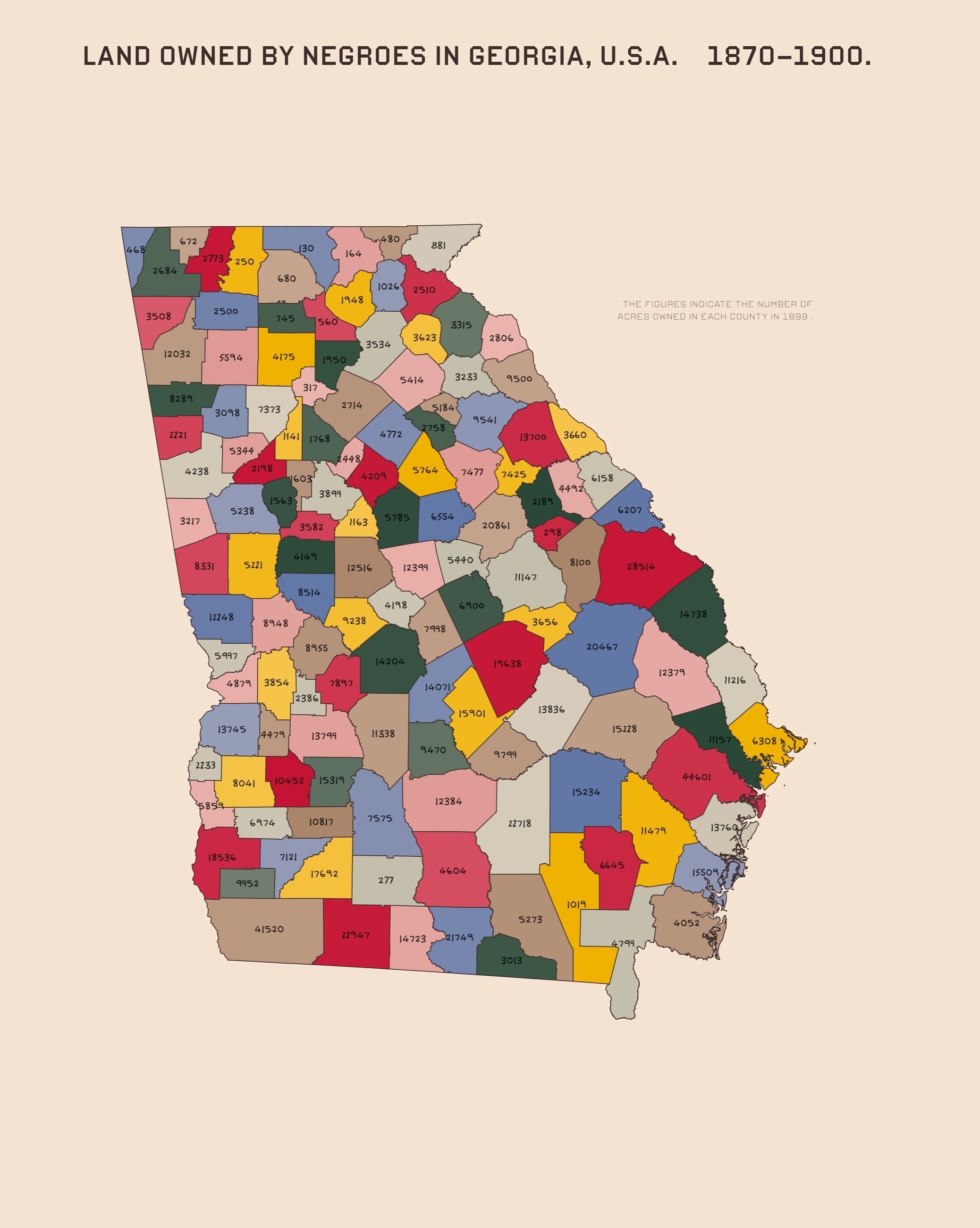
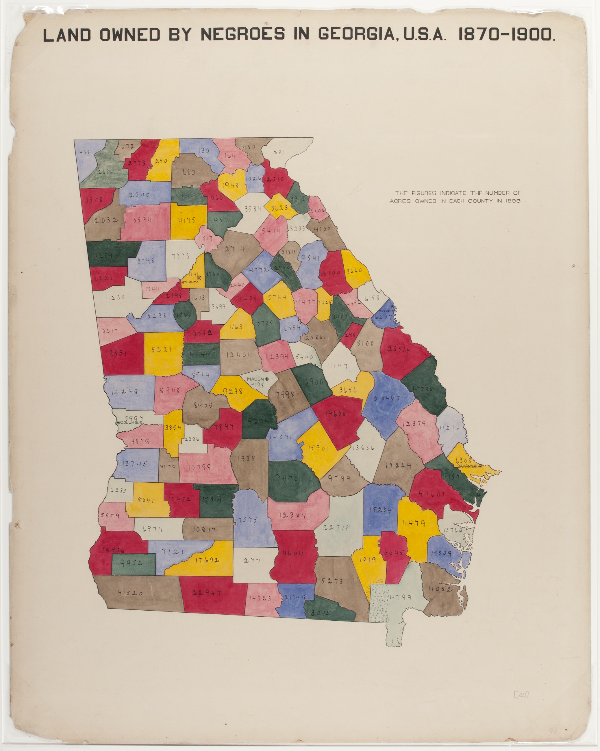
This chart would have been quite difficult for me to draw by hand, and even more difficult to revise once drawn. The process of re-creating it with digital tools emphasized how libraries like D3 can automate the tasks of drawing graphics and applying styles, enabling an efficient and iterative design process: D3 ingested a list of paths for each county and drew the entire map in under thirty lines of code, and global styling let me adjust the color, line width, and typography of similar elements with a few clicks rather than reworking each element individually. And though drawing the chart digitally eliminated much of the hand's character — the fluctuating line widths, the streaky pigment — I leveraged creative code wherever possible to retain that variation: the opacity function above is a simulation of human inconsistency.
That inversion is the lesson of re-creation. Du Bois' aesthetic decisions were neither ornamental nor incidental; they were central to his communicative goals, so central that faithfully reproducing them required engineering. Re-creating his work helped me see the data not just as numbers, but as a complex, layered narrative — and I began to grasp how digitally enhanced visualizations can echo Du Bois' ethos while pushing his design language further, using interactivity and emotion to deepen the impact of data-driven storytelling.
Plate IV · Second Mode
Re-creation taught me the precision of Du Bois' visual grammar. The next question: could that grammar be taught? Not copied, surface-feature by surface-feature, as I had just done — but distilled into principles a machine could learn and apply to something new. I opened a conversation with OpenAI's GPT‑4o, whose image generation can carry conceptual context across a dialogue,1919OpenAI, “Introducing 4o Image Generation,” March 25, 2025. The full conversation is archived here. and set out to teach it to see charts the way Du Bois did.
What follows is the actual conversation, replayed.
The setup
I began by asking ChatGPT whether it was familiar with Du Bois and his work in the field of data visualization. It responded with a robust summary of the Exhibit of American Negroes, citing his use of visual language as a political and educational tool.
The corpus
Alongside the prompt, I attached ten of Du Bois' charts from the 1900 exhibit as visual demonstrations of his style — the same ten plates that opened this webtext.
The machine reads
ChatGPT responded with a detailed breakdown of Du Bois' design language: color that carries semantic weight, functionally clean typography, handmade geometry, center-weighted composition, and intuitive form factors — along with his narrative layering and implicit commentary.
I found its understanding of Du Bois' style to be satisfactory, so I proceeded.
The subject
The chart I chose to re-imagine was Charles Joseph Minard's 1869 map of Napoleon's disastrous Russian campaign, which Edward Tufte famously called perhaps “the best statistical graphic ever drawn.” It is also a personal favorite of mine — growing up, my family hung a framed print of it on the wall as a piece of intellectual art.
The task
I asked the model to ignore the content of the chart entirely and focus on the image itself: to generate Minard's map as if it were one of the plates in the Exhibit of American Negroes.
The hiccup
Its first attempts were fluent in the style and wrong in the structure. The model kept reorganizing Minard into Du Bois-like panels — a poster with a thermometer, a four-part summary, invented geographies labeled MOPESCOW and MOSCAU. It had learned the look. It had not yet learned the layout.
The correction
So I re-anchored it with a single exemplar — one of Du Bois' own plates, attached — and asked again: Minard's map, in the style of this. That did it.
The grade
The result largely resembled actual examples of Du Bois' work: it accurately reflected his bold, earthen colors, included textural fills to mimic a hand-drawn graphic, and employed heavy, centered lettering to boldly declare what was being visualized.
The composition remained similar to that of the original Minard map — as instructed and intended — but its level of detail was simplified to the level common among Du Bois' charts.
And it missed a few marks. Its typography was curvilinear and uniform, in contrast with Du Bois' penchant for rigid, geometric block lettering; and it included no hints of political commentary or African American vernacular design, both of which scholars have noted are inherent to Du Bois' aesthetic.
Teaching Du Bois to a machine mirrored my own learning. The model began, as I had, by extracting surface tenets — palette, typography, composition, form — and its outputs grew richer the longer we conversed, just as my own understanding had deepened through re-creation. Even its failures were instructive: the early attempts that shattered Minard into tidy panels showed a model that had absorbed Du Bois' vocabulary without his syntax, and it took a concrete exemplar — not more description — to close that gap. The process confirmed that Du Bois' approach is tangible, qualifiable, and teachable — and that its deepest layer, the encoded resistance, resists transfer by example alone. In articulating his grammar precisely enough for a machine, I sharpened my own grasp of what makes the charts compelling — and carried it into the third mode.
Plate V · Third Mode
The final mode demanded something more personal: not redrawing Du Bois' charts or teaching his style, but extending his method — data visualization as a vessel for living history — to my own city. The blueprint was his 1899 masterwork of urban sociology, The Philadelphia Negro.2020W.E.B. Du Bois and Isabel Eaton, The Philadelphia Negro: A Social Study (1899).
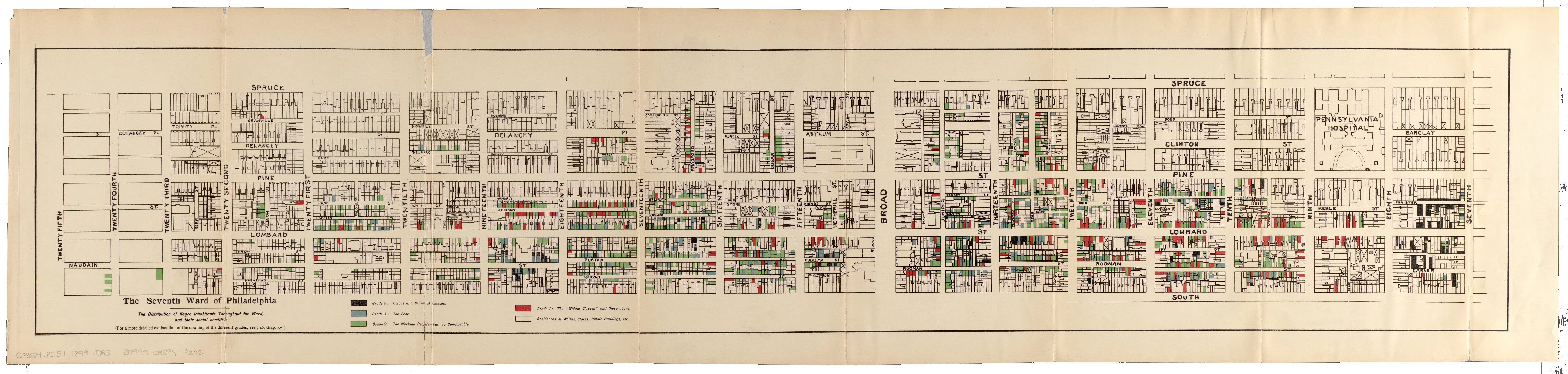
Prevailing narratives framed Black Philadelphians as inherently predisposed to crime and poverty. Du Bois answered with data: he and his wife moved into the Seventh Ward and surveyed over 2,500 households door to door — employment, housing, education, family structure — then mapped, by hand, every household in the ward, classified on a four-class axis from “Middle Classes” to “Vicious and Criminal.” This typology was a deliberate choice, made to highlight the internal “variability and social stratification” that existed within Black urban communities in Philadelphia — an idea that mainstream sociological narratives often omitted. The map revealed that socioeconomic conditions, rather than an inherent racial predisposition, underpinned patterns of crime, poverty, and hardship within the Seventh Ward.2121Stephanie Boddie and Amy Hillier, “The Making and Re-Making of The Philadelphia Negro,” DHQ 16, no. 2 (2022).
Below is Du Bois' map of the Seventh Ward, in full.
A century and a quarter later, I applied the same cartographic argument to Tucson, Arizona. I lacked the resources for door-to-door ethnography, so I adapted: the Pima County Geospatial Data Portal's parcel dataset — nearly 450,000 records — supplied the raw material,2222Rob Hastings, “Parcels – Regional,” Pima County Geospatial Data Portal (2018). and I bounded my study area by Grant Road, 22nd Street, Interstate 10, and Campbell Avenue: downtown, the University of Arizona, and the residential fabric between.
For Du Bois' focus on Black residences I substituted Tucson's historic and neighborhood preservation zones — the neighborhoods the city itself declares culturally valuable in its zoning code. In the city's Unified Development Code, the letter H distinguishes a historical preservation zone, the letter N a neighborhood preservation zone, and the R a residential parcel — the codes on which I filtered the parcel dataset.2323City of Tucson, Unified Development Code (2024). Zoning codes HR‑1/2/3, NR‑1/2/3, HLR‑2, HOCR‑2. For his hand-blended four-class typology I substituted an objective proxy for wealth: each parcel's full cash value, an estimate of its market value. To determine the most meaningful divisions of wealth, I plotted a histogram of all relevant parcels' values and identified natural inflection points within the data: under $100,000, to $250,000, to $500,000, and above. Four grades, exactly as Du Bois assigned each household to one of four categories. His palette, sampled from the Seventh Ward map itself. His serif legend, his handwritten street labels, his beige board.
I departed from Du Bois' style in a few key areas, though. Whereas Du Bois labeled every street in the Seventh Ward, often more than once per street, I labeled only the streets that define the historical and neighborhood preservation zones included in the map, so as not to crowd it with extraneous labels. And whereas Du Bois focused on one continuous neighborhood, I chose to highlight various residential areas around the city — allowing me to explore how economic stratification plays out across spatially distinct neighborhoods with preservation status in common, and inviting clear comparisons on the part of the viewer.
The result is below. Follow the tour, then take the map.
Scroll to tour · then explore freely
The study area
I bounded my study area by Grant Road and 22nd Street to the north and south, and by Interstate 10 and Campbell Avenue to the west and east. Preserved residences take a color from Du Bois' palette; every other parcel recedes into the paper.
Barrio Viejo
South of downtown lies Barrio Viejo, Tucson's oldest barrio, whose adobe rowhouses survived the bulldozers of urban renewal. The pressure of gentrification appears here as a flush of red — parcels crossing the $500,000 line on streets that also hold the darkest grade.
West University
Between downtown and campus, the West University historic district wears mixed grades — olive and sage mid-values sit shoulder-to-shoulder with red, as preservation status and proximity to the university both capitalize into price.
Jefferson Park
North of campus, between Speedway and Grant, Jefferson Park holds the densest cluster of preserved homes in the study area. Its early-twentieth-century bungalows wear every grade at once — greens and reds interleaved block by block — as the university's gravity pulls values upward street by street.
Your turn
The map is now yours — pan, zoom, and hover over any parcel to see its value and grade. Choosing which zones to include, where to set the value thresholds, and how to classify each home were all epistemological decisions on my part. I invite you to read the map critically.
Working within these constraints, I considered the same questions Du Bois did: how to distill lived experience into visual form, how to balance empirical accuracy with narrative force, and how to embed complex meaning within aesthetic choices. I retained many of Du Bois' stylistic techniques, emulating his proven approach to powerful visual storytelling; where necessary, I deviated, adapting creatively to data limitations and prioritizing narrative clarity over strict fidelity to his method. These deviations were not compromises, but rather reflections of the evolving tools that we use to visualize such robust data today. Drawing from Nancy Peluso's concept of counter-mapping and from Hepworth and Church's framing of data visualizations as inherently rhetorical, my Tucson map became a localized counter-map, leveraging spatial distribution to visually critique economic disparity across the city. Choosing which zoning codes to include, how to define the value thresholds, and how to classify homes by color became a series of epistemological decisions — not neutral choices, but acts of narrative construction, shaping how the data in my map would be read, understood, and felt. In that process, I came to understand one of Du Bois' most salient lessons: data visualization is a form of authorship, and every design choice is a line in the narrative.
Plate VI · Culmination
If W.E.B. Du Bois were alive today, how might he tell the stories of Black America with modern, immersive technology? That question drove my contributions to Hello, Black World — a collaboration between the University of Arizona and Howard University reimagining Du Bois' legacy through immersive data storytelling. As lead developer I built three interactive, web-based visualizations, each applying his design language to contemporary data on the African American experience. They do not replicate his style; they adapt his rhetorical intent, spatial logic, and radical clarity into a participatory medium. The three works are embedded below in full. Take the controls.
In creating the visualization Black Space and the Environment, I was inspired by Du Bois' innovative use of spatial visualization. Particularly, I admired his ability to transform the form factor of a map from a passive geographic display into an active argumentative work. In his map of Philadelphia's Seventh Ward, Du Bois seamlessly blended spatial, demographic, and socioeconomic data into a single form factor. His map featured a third, rhetorical dimension that laid bare the structural inequities driving the data he collected.
In my own approach, I sought to mirror this dimensional thinking. I aimed to design a three-dimensional experience that merged the spatial logic of a choropleth map with the dimensional narrative of a bar graph. What emerged from this intersection was a data-driven topography of sorts: a 3D map of the state of Pennsylvania, in which each county rises like a bar on a bar graph, transforming the geography of the state into a vertical index of health disparity. Within this map, the color of each county denotes the proportion of Black residents within its population, and the height of each county encodes the normalized incidence of environmentally driven conditions like asthma, COPD, and lung cancer.2424Demographic data from the U.S. Census Bureau; health data from the American Lung Association. Presented here exactly as built for Hello, Black World.
This visualization imagines the state of Pennsylvania as a bar graph. The height of each county represents the relative age-adjusted prevalence of environmentally provoked conditions, and the color of each county represents its relative Black population.
12.73% of Pennsylvania's population is Black or African-American.
8.52% of Pennsylvania's population suffers from asthma.
Pennsylvania, flat
Begin the way Du Bois began: with geography. Sixty-seven counties, each colored on a scale drawn from his palette — off-white to brown — by the proportion of Black residents in its population.
The rise
Now the second dataset arrives, and the map becomes a bar graph. Each county rises to the normalized incidence of an environmentally driven condition — asthma, to start. Geography becomes a vertical index of health disparity.
How it was built
Sixty-seven individual 3D county models, rendered in .gltf format with Three.js. Demographic data from the U.S. Census Bureau; health data from the American Lung Association, imported and formatted with Python, then normalized to a 1–10 scale. A function interpolates each county's Black population into a color between off-white and brown; GSAP animates the heights.
Reading it
As you take in the skyline, consider the questions the shape asks: are Black communities disproportionately affected by these environmentally driven conditions? And what systemic or institutional mechanisms might be fueling the correlation? In keeping with Du Bois' approach, the goal is not simply to present statistics, but to provoke critical thinking about why the numbers are the way they are.
Take the controls
The map is yours: click and drag to orbit, hover a county for its numbers, and switch conditions with the buttons below — including poverty, the economic thread that runs beneath the health data.
This visualization extended Du Bois' visual grammar into a distinctly immersive, three-dimensional space. Whereas Du Bois used maps and bar charts as separate modalities across his visualizations, Black Space and the Environment fused them into a new, spatially enhanced form factor. The visualization invites viewers to physically engage with the shape of inequality, quite literally orbiting around systemic health disparities in virtual space. In doing so, it honors Du Bois' original intent: to render structural inequality visible, and now, navigable.
I was inspired to create The Blossoming of Black Literature by the topic and form factor of one of Du Bois' 1900 charts, entitled “American Negro newspapers and periodicals.” The chart detailed the presence and prevalence of Black journalists in the late 19th century. Rather than relying solely on numbers, Du Bois drew a pyramid of layers with contrasting colors to illustrate the structure and underlying hierarchy of the Black press — leveraging the shape, height, and visual weight of each layer to imply the cultural importance of Black journalism. The chart showed a strikingly large number of Black-authored periodicals in circulation at the time: a proportion of the press large enough to pave the way for discourse concerning the budding civil rights movement.2525W.E.B. Du Bois, American Negro Newspapers and Periodicals, ca. 1900. Library of Congress.
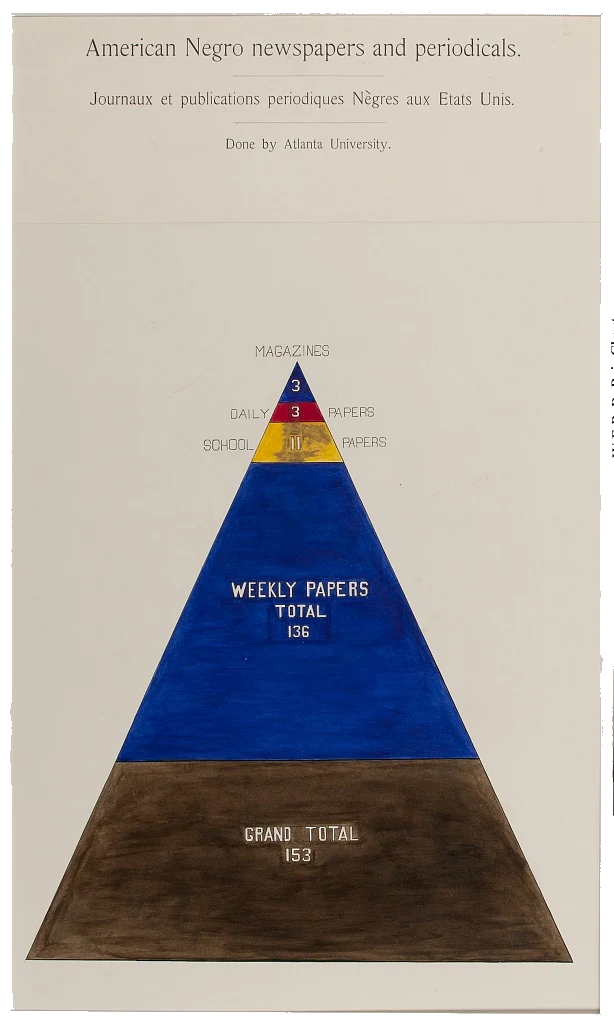
In my own visualization, I sought to emulate Du Bois' shape-forward approach and extend his focus on Black authorship to the modern day. I did so by constructing a digital array of pencils, each representing a year's worth of books published by Black authors between 1985 and 2021. These pencils rise in height according to the proportion of Black-authored titles published in that year, creating a bar chart of sorts that is as tangible as it is statistical.2626Data from the Cooperative Children's Book Center, University of Wisconsin–Madison; refers to books published in the US and Canada.
From pyramid to pencils
Du Bois implied cultural weight through stacked shape. Here, the shape is a pencil — a recognizably human object in place of a bar — making the data more memorable and salient, exactly as the memorability research in Plate II predicts.
The procession
As you scroll, the years grow in from 1985, pencil by pencil, left to right — a procession of authorship. Watch the leap at the end: between 2017 and 2021, the proportion of Black-authored books nearly tripled, from 3.6% to 9.2%.
How it was built
Each pencil is rendered with Three.js in three .gltf parts — the tip, the body, and the eraser — a modular structure that lets the body stretch without distorting the ends. Python processed the Cooperative Children's Book Center data into a dictionary mapping each year to its authorship percentage, and GSAP animates the growth.
Your turn
Hover across the pencils to follow literary history year by year. As you do, consider what world events shaped each rise and dip — why did Black authors see such an increase in representation, what might the trend look like in the future, and how can we keep it moving in the right direction?
The Blossoming of Black Literature extended Du Bois' visual grammar into an immersive and interactive dimension by concretizing how data changed over time. It charts a timeline of representation, transforming raw data into a procession of authorship, year after year. The pencils rising and lengthening in virtual space embody the persistence and proliferation of Black voices over the past few decades. In shaping data into something as familiar yet metaphorically rich as an array of pencils, the visualization creates a narrative of emergence: the steady accumulation of Black authorship, made legible through familiar form and intuitive interaction. In this way, it adapts Du Bois' narrative clarity to the digital age, imbuing the arc of Black literary history with dimensional resonance.
My final contribution to the Hello, Black World project drew inspiration from Du Bois' original charts detailing Black cash flows and property ownership. I was particularly intrigued by two of his charts: “Income and Expenditure of 150 Negro Families in Atlanta, GA, USA,” which broke down spending habits among Black families in Atlanta by income class; and “Valuation of Town and City Property Owned by Georgia Negroes,” which traced the growth of Black land ownership in the state of Georgia throughout the Reconstruction era.2727Both ca. 1900, ink and watercolor. Library of Congress Prints and Photographs Division.
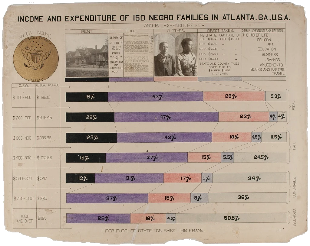
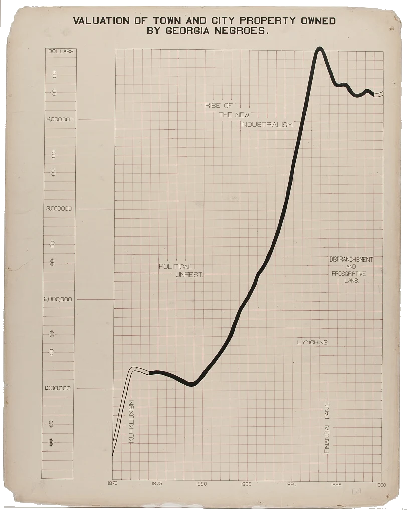
Both charts leveraged the creative use of color, line, and form to make visible the complex economic patterns among Black Americans at the time. They were both analytical and aspirational in nature: charts of lived reality that also envisioned possibility. In my visualization, Homeownership Across Race, I sought to carry this spirit forward. I envisioned a digital neighborhood of 3D homes, whose changing sizes over time represent the fluctuation of differential homeownership rates across racial groups in the US — from 1994 to 2021, across white, Hispanic, Native, Asian, and Black Americans. Each home is color-coded using Du Bois' original palette and placed in a virtual cul-de-sac.
This visualization imagines differential rates of homeownership as a neighborhood.
Explore how the size of each home changes over time to reflect the rates of homeownership by race.
Homeownership rates in 1994:
White Americans: 67.7%
Hispanic Americans: 41.2%
Black Americans: 42.3%
Native Americans: 51.7%
Asian Americans: 51.3%
The neighborhood
Five homes share a cul-de-sac — one per racial group, each colored from Du Bois' palette. The shared street is deliberate: a metaphor for the shared sociopolitical system that manifests these differential rates. The size of each home is its group's homeownership rate.
1994 → 2004
As you scroll, a decade of growth: Black homeownership climbs from 42.3% toward its all-time peak of 49.1% in 2004, and Hispanic homeownership follows a similar arc. The houses swell — but watch the blue house, which starts ahead and stays ahead.
The collapse
Then the subprime crisis, which hit Black and Hispanic homeowners hardest. By 2016 the brown house has shrunk below where it began: 41.6%, lower than 1994. The waxing and waning of these homes translates decades of housing data into a spatial and temporal metaphor — disparate roadblocks in the path to the American dream.
How it was built
The houses are custom 3D models in .gltf format, built in 3D Builder and rendered with Three.js; the cul-de-sac is a custom model as well. Python parsed Census Bureau data into a nested dictionary — race, then year, then rate — and GSAP animates each home's scale to the selected year.
Take the controls
The neighborhood is yours: move the slider or use the arrow keys to travel the years, and use the view buttons to orbit, reset, or look straight down. Which homes grew? Which stagnated? What systemic forces might explain the pattern?
The result is a digital landscape that transforms economic data into an interactive neighborhood, prompting viewers not just to observe inequality, but to explore it in virtual space. Homeownership Across Race extended Du Bois' distinctive visual grammar by transforming temporal data into embodied, architectural form. Where Du Bois used flat charts to track patterns in economic change, my visualization brought that narrative into a new dimension by translating the passage of time into the rise and fall of spatial symbols. The form factor of a shared cul-de-sac created a tangible canvas for comparison on which racial disparities became clearly and spatially comparable. In its form and function, Homeownership Across Race honored Du Bois' belief in the power of data to narrate inequality, rendering not only numbers on a page but physical representations of how change has been unevenly built over time.
“The South believed an educated Negro to be a dangerous Negro. And the South was not wholly wrong; for education among all kinds of men always has had, and always will have, an element of danger and revolution, of dissatisfaction and discontent. Nevertheless, men strive to know.”W.E.B. Du Bois · The Souls of Black Folk · 1903
Plate VII
What initially appeared to be straightforward, artistic charts emerged, through three modes of re-engagement, as intricate rhetorical devices — layered with intentional choices of color, form, proportion, and composition. Re-creating the Georgia choropleth, I experienced firsthand the meticulous effort required to balance design and data; every aesthetic decision was tied to a rhetorical goal, affirming Klein's insight that visualization is epistemological — it shapes knowledge rather than simply presenting it. Teaching Du Bois to a generative model forced me to encode his style precisely enough for a machine, proving his grammar can be taught, transferred, and evolved. And re-interpreting his method in Tucson demanded I adapt his rhetorical strategy to alien data, turning zoning codes and cash values into acts of narrative construction. Similarly, Yuke Zheng's framing of Du Bois' work as occupying a liminal space between data and art became increasingly evident as I layered spatial data with aesthetic fidelity to his originals — creating my own example of that liminal space.
Extending Du Bois' visual grammar into interactive, three-dimensional space was not a technological leap; it was a philosophical continuation. Du Bois used charts not just to visualize statistics, but to structure his arguments about race, place, and inequality. As Lynda Olman argues, his work was a radical act of decolonizing the infographic, embedding African American vernacular motifs and resisting the reductionist nature of conventional visualization. My immersive contributions to the Hello, Black World project carry forward this resistance. By merging Du Bois' aesthetic with interactive web-based technology, I built visualizations that invite viewers to rotate, zoom, and navigate the data in front of them. This dimensional leap aligns with Gong et al.'s findings that augmented reality improves user engagement and comprehension. Interactivity was not simply ornamental; it became a rhetorical strategy — a new way of guiding viewers through complex truths, just as Du Bois once did on paper.
What distinguished my immersive visualizations was not just their interactivity, but their spatial nature. Viewers can orbit around counties in Pennsylvania, pick up pencils that represent datapoints, and examine virtual architecture that reflects economic disparities. These experiences tap into models of spatial reasoning that are innate to the human mind, as suggested by Zacks and Tversky's research on the differential cognitive perceptions of form within charts. Just as bar charts prompt discrete comparisons in the minds of viewers, spatial immersion prompts embodied cognition. By exploring a visual space, users aren't merely seeing data; they are situated within it. Gall et al.'s study on embodiment found that users who identify with virtual perspectives experience heightened emotional resonance with the data in front of them — and this is precisely the effect Du Bois aimed to accomplish through his idea of affective design. His charts were not passive; they were provocative, as Bartram et al. and Bateman et al. reinforced in their studies of affective color and embellishment. I leaned into that scholarship as I crafted the visualizations, pairing symbolic shapes such as pencils and houses with motion, interactivity, and Du Bois' poignant color palette — crafting visual arguments that resonate cognitively and emotionally with their viewers.
Immersive data visualization holds immense pedagogical potential. Du Bois made data stories accessible to a general audience at the Paris Exposition; immersive tools let students walk through specialized histories, rotate sociological patterns, and explore inequality in motion. The literature supports it — immersive experiences evoke stronger responses and foster empathy — and educators should embrace these tools as supplements to traditional teaching, activating learning modalities that static figures cannot reach.
As we give data physical form, we must remain vigilant about whose stories are told, how they are framed, and what is omitted. Maps can erase as easily as they reveal; immersive storytelling risks aestheticizing suffering if handled carelessly. What is evocative for one user may be traumatic for another. The obligation, then: co-design with communities in mind, and embed transparency, annotation, and sensitivity into every immersive experience. Immersion can reveal — but it can also distort.
Du Bois' legacy lies not only in the stories he visualized but in how he visualized them. He built visual arguments for a world not yet ready to hear them. In the same spirit, today's scholars must think beyond flat figures and static reports — we have the tools to create immersive, interactive arguments interpretable by anyone, and we must use them with purpose: to uplift lesser-told narratives, to challenge dominant epistemologies, to bridge the gap between communities and data. Immersive data visualization is not just a new aesthetic. It is a new frontier of scholarship. It calls on us, as Du Bois once did, to imagine more: more dimensions, more voices, more stories.
Plate VIII